Riyadh Origin/Destination Analysis - National Day
Python | Power BI | SQL | Rest Apis
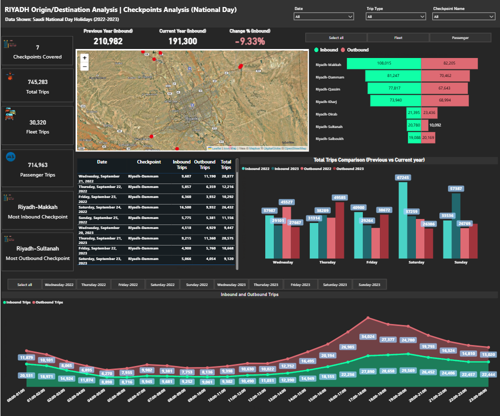
The dashboard's purpose is to provide a clear, real-time overview of inbound and outbound trips, checkpoint activity, and passenger statistics. Key features include:
-
KPIs: At-a-glance metrics for "Checkpoints Covered," "Total Trips," "Fleet Trips," and "Passenger Trips," providing a high-level summary of operational performance.
-
Time-series Analysis: A detailed breakdown of "Inbound" and "Outbound" trips by date, allowing for trend analysis and historical comparisons.
-
Geographic Visualization: A map-based interface that visually represents checkpoint locations and their corresponding trip volumes, providing a spatial context to the data.
-
Trip Comparison: A bar chart that compares "Inbound" and "Outbound" trips between the current year and the previous year, highlighting growth or decline percentages.
-
Hourly Breakdown: A detailed line chart that tracks "Inbound" and "Outbound" trips on an hourly basis, revealing peak travel times and operational patterns.
-
Checkpoint Ranking: A list of checkpoints ranked by the most frequent "Inbound" and "Outbound" trips, helping identify the busiest hubs.